AFIC
GOLD winner at the Melbourne Design Awards 2019
Investing in a new website to expand the customer base
The Australian Foundation Investment Company, AFIC for short, is Australia's largest LIC. For those not in the know, an LIC is a managed investment portfolio listed on the Australian Stock Exchange (ASX). Investors buy shares in AFIC, which gives them access to a diversified portfolio of quality companies. Such investors are betting on AFIC managing the portfolio efficiently to grow the value of shares and provide dividends.
AFIC use almost a century of investment experience to manage assets on the ASX, but their existing website was outdated and not attracting new investors. Our vision was to redevelop the site with a complete visual transformation and offer a better user experience to a growing customer base.

Data proved the website’s users were different from existing customers
AFIC’s existing audience are seasoned investors aged between 45-65. They invest large sums of their savings into AFIC shares with a view that the long term investment approach provides a steady income with a lower risk profile.
However, the majority of people using the website were not this audience. New investors were coming to AFIC’s existing website to learn about the basics, and that information just wasn’t there.
After completing a survey, AFIC found that 64% of new investors were at the start of their investment journey. They were interested in the long term performance of investing in AFIC, appreciated the fact the company had a long-standing history, and that they took the leg work out of accessing a diversified portfolio. The largest group of new investors were in their 30s and learned about AFIC through financial blogs like Barefoot Investor.
AFIC needed a website that communicated to this younger, straight-talking audience. It would be devoid of jargon. It would highlight AFIC’s experience as a benefit, not a brag. It would educate first-time investors to help them decide if AFIC was right for them and explain – in plain English – how to get started.

Designing a website that works for diverse user groups
The project was never going to be about updating the existing website and retrofitting it for a new audience. The design needed to be entirely different.
The aesthetic would be vital in building trust with a digital-first audience. We wanted it to stand out from competing sites as a fresh take on investing. A way of instantly communicating: we may have started in 1928, but we haven’t rested on our laurels. Nothing about the site would say ‘outdated’.
But we couldn’t alienate AFIC’s existing customers either. They may be a secondary audience, but they still have key tasks to perform on the site, like checking the portfolio performance and dividend price.
Financial advisors also use the site to check reports and portfolio data. With three audiences and a different set of needs for each getting the information architecture right was challenge number one.
UX research helped us engineer a site that meets the needs of diverse user groups. The result has transformed a glitchy and confusing website into one that’s a joy to use.
Considering the workflow of internal users, the project also explored ways to create operational efficiencies with the generation of digital reports.

User experience design
We discovered the wants and needs three core user groups and mapped out their journeys. We learned which content was vital and what was nice to have. This process enabled us to develop a sitemap that’s easy to follow no matter the user or task.
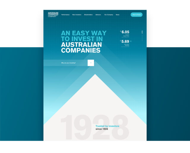
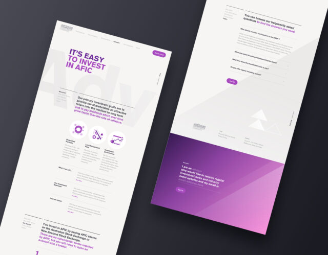
Finding AFIC’s performance data is the single task shared by all. We placed it prominently in the primary navigation and displayed key stats on the homepage. We gave each audience a section that meets their needs, differentiated by colour.
The design revitalised the AFIC brand for a ‘barefoot’ audience. We emphasised existing brand elements like colour and typography for striking impact. We brought the idea of growth to life through the scrolling parallax effect – a rising chevron symbolising an upwards movement in knowledge and wealth.
The site is devoid of financial jargon to make the user journey pain free. Bold headings and succinct copy get to the point quickly. Once we instil users with the knowledge they need to invest, we help them get started.
Users can’t invest in AFIC directly. They must go through an online broker platform or stockbroker. We surfaced impartial broker information from the ASX website to streamline the journey from awareness to purchase.
We created operational efficiencies with a dynamic PDF generator, saving the AFIC team time on what was manual reporting. Data captured from the website can be added to a pre-designed template becoming an instant but editable report.

AFIC’s new digital home has already reaped dividends
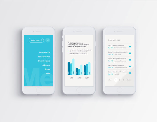
We built a responsive website that works beautifully across devices to educate new investors and fulfil the needs of shareholders and advisors.
We included a newsletter signup element to increase the opt-in email database and create future marketing opportunities.
A launch optimisation strategy supported the website. Ensuring the site gets indexed by Google and found by users conducting search queries.
We upgraded and set up Google Analytics, Google Tag Manager and Google Search console. We implemented sitemap.xml and indexed it with Google to ensure the new site and all its pages were visible to Google.
We implemented keyword-rich meta-data to make the page discoverable through organic search. Page-level redirects carry over the SEO value accrued by existing pages and carry it over to the new pages.
The new site has given AFIC an edge over old-fashioned competitors to reach a younger audience - targeting a critical market that could no longer be ignored.
Gold winner in the 2019 Melbourne Design Awards.