Burch & Purchese
A responsive and engaging move from retail to digital
If you’ve got a sweet tooth, you’ve likely heard of Darren Purchese. Considered one of Australia’s most respected pastry chefs, and a regular Masterchef Australia guest, Darren has built a reputation on his downright decadent and delicious desserts. A reputation so beloved that he’s written, and published, five different cookbooks.
But he’s not alone in his confectionary calling. He founded Burch and Purchese Sweet Studio alongside his wife, Cath Claringbold, back in 2011. And ten years on, their studio continues to be a Melbourne institution known for its edible art and glorious handmade creations.
That said, COVID-19’s global pandemic threw the Burch and Purchese team a few curve balls. Not all of them dipped in chocolate and spiked with rum. They decided to change with the times and quickly pivoted to an online-only business model. The studio team also came to the kitchen table with ideas for new revenue streams, including virtual cooking classes and a new range of Burch and Purchese products sold nation-wide.
But where does Evolution 7 come in? Burch and Purchese needed our expertise to help them take this bold business step. Moving from retail into the digital world is no easy feat, so we were there to update their website to be a responsive, engaging and, most importantly, evolving digital platform that captured the joyous Burch and Purchese brand and provided exceptional user experience.
Update March 2023: Sadly, Burch & Purchase have now closed their Sweet Studio in Prahran and the site was decommissioned, however we have left the showcase here as an exanple of our work.

A broader digital platform to support growth & offerings
Priority number one: overhaul their temperamental old Umbraco site. The main roadblock for the Burch and Purchese team in their e-commerce journey was dealing with a previous site that was difficult to use, hard to maintain and prone to crashing whenever faced with significant traffic.
The previous website also didn’t reflect the goals and ambitions of the Burch and Purchese mission, or reflect the increased importance of offerings such as the virtual cooking classes.
We were tasked with creating a site that highlighted their exciting new products and delivered excellent user experience commensurate to the artistry and attention to detail of the Burch and Purchese brand. Lastly, this new website needed to serve as a broader digital platform that would support Burch and Purchese growth and offerings in the future.

Striking design & reliability
Burch and Purchese needed an updated, uplifted, upgraded website that could expand with new products, grow with new offerings and include new categories. Not to mention the ability to host additional content.
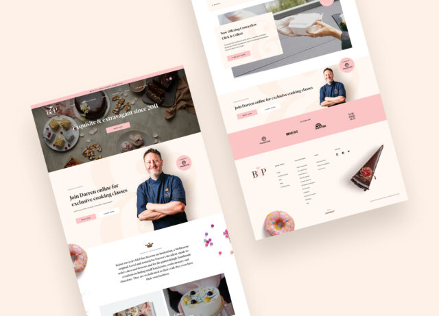
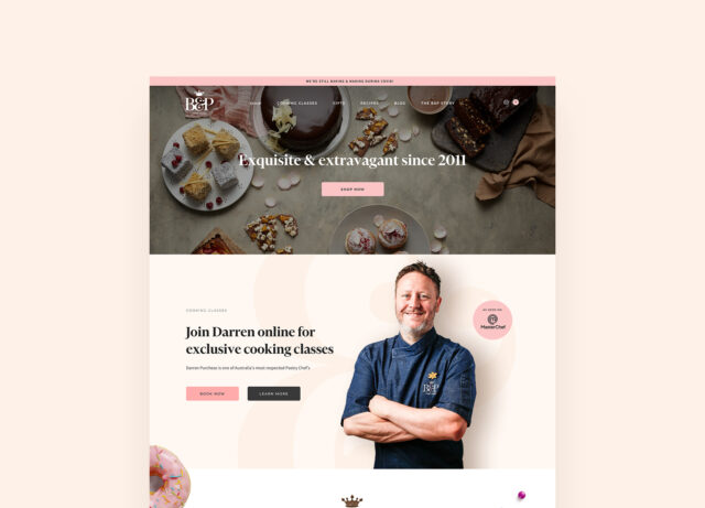
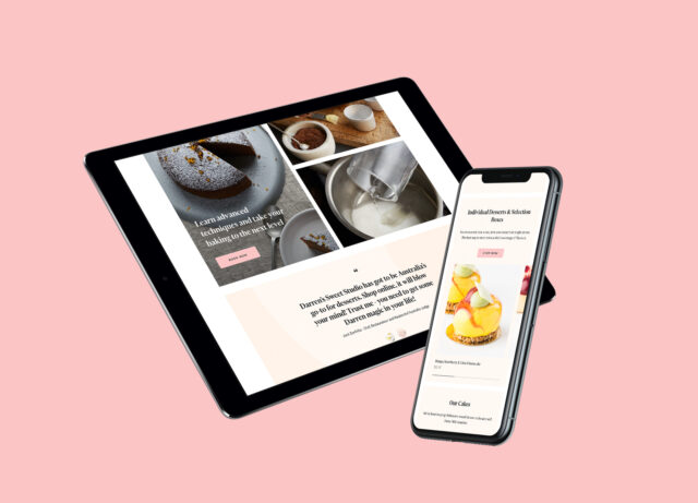
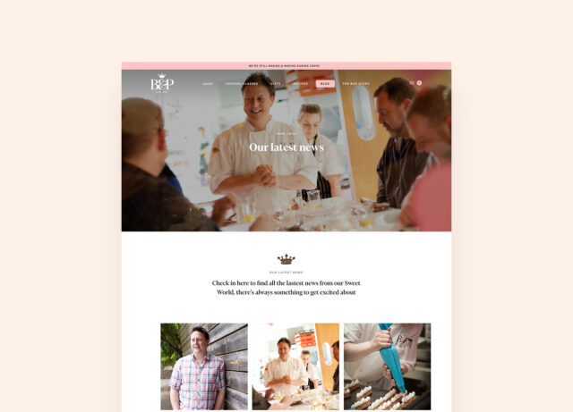
We began by designing a striking new site, responsive across mobile, tablet and desktop, that fit the Burch and Purchese brand, so it would appeal to both loyal and new customers alike. We continued by highlighting the key products and new digital offerings with a brand experience that supported both traditional ecommerce and virtual cooking events.
High on the list was implementing an open source and reliable technology platform that supported best practice, was standards compliant and covered all key requirements for SEO, accessibility and social media. Content management was also a major focus, as the studio team would need the ability to update and deliver dynamic content across the site.
Lastly, the platform needed to be scalable, reliable and positioned for future growth. This meant we included modular ability to expand content and offerings, unlimited bandwidth to support peaks in traffic and used a Content Delivery Network (CDN) to improve site speed to users all around the world.
"Moving into a new eCommerce business model was essential for our business during COVID. Evolution 7 stepped up to the plate and quickly provided us with a smart, functional, and visually stunning platform.Our site is easy to navigate for customers and easy for us to maintain and operate. Evolution 7’s ongoing support and advice has meant we are confident in moving forward as a business."

A playful UX
When it comes to a new e-commerce business, user experience is everything. Our approach to the site’s design aesthetic was to really elevate the stunning products (think handmade cakes and sweet jams) and communicate the creative, playful nature of the sweet studio itself. We did this by choosing to use strong serif typography, which brought a sense of luxury, and incorporating playful, top-down photography.
Burch and Purchese also wanted the new site to match the in-store customer experience. To do this, we made it possible for digital customers to interact directly with the Burch and Purchese brand. A major way that we achieved this sense of intimacy and connectedness was to bring Darren Purchese to the front of the site, strengthening his connection with customers.
By enabling customers to order online and select delivery or pick up, it changed the way the Burch and Purchese business operated on a daily basis. Now users are able to view their orders in more detail, check on the status of their order, track delivery dates and times. Burch and Purchese, for the first time ever, are able to use Shopify features to manage their customer database and create ongoing, relevant marketing material. Not to mention adding seasonal products and offerings. Sometimes, and most definitely in this case, change is a good thing.