Clean Energy Council
Empowering Australia to clean up its energy
The Clean Energy Council (CEC) is the peak body for the clean energy industry in Australia. The not-for-profit is committed to accelerating the transformation of Australia’s energy system to one that is smarter and cleaner. As the organisation has evolved, its network of websites no longer met business or user needs. The CEC wanted to enter into a website redevelopment project that would vastly improve the service experience through its digital platforms for key audiences.
After an RFP tender process, the CEC selected Evolution 7 to design and engineer a digital solution that could respond to the needs and behaviours of multiple audiences and serve as a digital home for clean energy. We undertook significant user experience research to consolidate the CEC’s business under one roof and connect the right information to the right stakeholders to maximise awareness, membership leads, and event bookings.

A complex mission in information architecture
The CEC is a membership organisation which represents and collaborates with over 600 leading businesses operating in the renewables sector, along with more than 6000 solar installers. Acting on behalf of its members, the organisation lobbies the government for improved policy and works with the industry to advance Australia’s demand and supply of clean energy.
The CEC’s preexisting digital presence included six websites tailored to specific audience groups and business functions. With consumers, industry and government stakeholders accessing information across different websites, the user experience was ineffectual with potential members and advocates becoming lost and abandoning the sites. One of our core challenges would be in ensuring the right information was getting to the right people.
Because of the scale and size of the redevelopment project, it was split into three phases. This met the financial needs of NFP business while getting great work underway. Phase one, discussed in the following showcase, focused on the strategic setup and core site development. Kicking things off with the largest challenge: how do we restructure the information architecture of six existing websites?
Primary CEC website properties included:
Clean Energy Council Website - targeted to business members
Solar Accreditation website - targeted to solar installers (information about becoming an accredited installer, along with a login portal where installers can complete assessments and apply to be accredited and manage their accreditation). This website also targeted general consumers with information around clean energy, the solar industry, how to purchase solar for your home or business, and legislative information (govt schemes, complaint, warranty info) for consumers
Clean Energy Summit - a standalone website for the annual clean energy council event
Secondary CEC websites included:
Chinese language site
Insulation installers site
FPDI website aligned to a specific project the CEC previously completed
Evolution 7 Services that brought the project to life
The CEC project involved most of the team at Evolution 7; from digital strategy specialists to UX designers to front and backend developers. Skilled project managers worked with the client to set the project phases before managing them in bite-sized chunks known as epics.
Digital Strategy | Design | Development |
Advanced and custom tracking, advanced SEO, SEO migration, user interviews, navigation testing, launch optimisation | UX workshops and design, information architecture, navigation, page layouts, branding, typography | CMS and site setup, global site components, filtering and search, interactive site features, Bizzabo Events integration, contact forms. |
Setting project goals
As a UX driven agency, we always put the user at the centre of projects. And lucky for us, the CEC was on the exact same page. Their key objectives put users first to drive business results.
- Deliver excellent service to three core audience groups
- Improve overall engagement and satisfaction with websites
As a member-based organisation, it would be essential that the new website encourages new membership as well as event bookings – both being key drivers of income for the organisation. While operational objectives included the collection and management of high-quality data and a reduction in web-related phone calls.
Listening to audience groups
Finding a core insight about our audience was a challenge because of the different market segments and related sub-brands within the CEC. By understanding the needs, differences and similarities of groups, we defined three core targets:
Industry (mostly members)
Solar installers
Consumers
Digging into customer research we learned that service, accessibility and responsiveness were key areas for improvement. Further research revealed an overall decline in NPS, although in part due to an expansion of survey respondents from previous years, it remained a signal to listen further to our audience and meet their needs on the new website.
We conducted interviews and workshops with the CEC as well as installers, consumers, manufacturers and members. We learned that across the board, each group had a hard time finding the information they needed, they were confused by the multiple websites and they couldn’t work out how to get in touch with the CEC. Consumers, in particular, felt overwhelmed and confronted with too much information – a lot of which was technical jargon.

From little things big things grow
Initially considering consolidating the six sites into three, our UX research established the concept of a single site. A branded home for the CEC where every type of audience could learn and act. We just had to figure out the best way to structure a site with so much information.
Learning from real people that used the pre-existing sites, we developed audience personas to guide our decision making. We undertook extensive navigation testing with each core audience segment which further clarified where users would expect to find information. Overall, all user groups would benefit from clear labelling and defined sections.
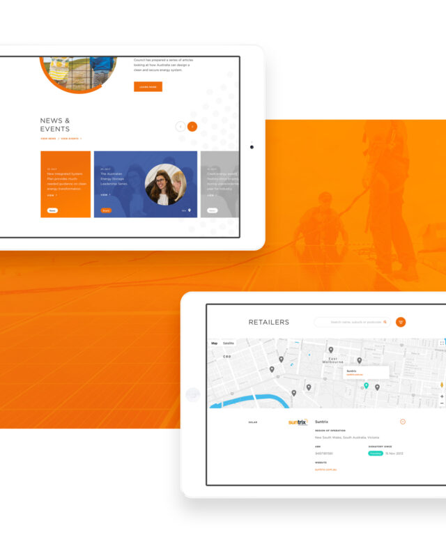
Understanding the priority audiences – in terms of audience size and value to the business – we developed three separate sections for members, consumers and industry. These users can now find relevant content at the click of a button. We also implemented a site-wide search function with category filtering to make it easy to find specific content.
Other areas that had previously caused confusion were client logins – different for each site – and contact information. We consolidated logins into the single site where users can log in with their existing details. The contact page was overhauled so that users can contact the relevant department, making the process easier for both users and staff.
Consolidation and effective navigation were only possible by working with key stakeholders throughout the project. We mapped the information architecture together with them, testing and eliminating assumptions throughout the comprehensive UX design process.

Eradicate confusion with minimal design
Our design team worked within the CEC’s brand guidelines but were given flexibility in terms of overall look and feel as well as selecting core colours from an existing palette. There were two main challenges when it came to the design: how do we limit distraction for users and how do we embody an innovative and collaborative industry.
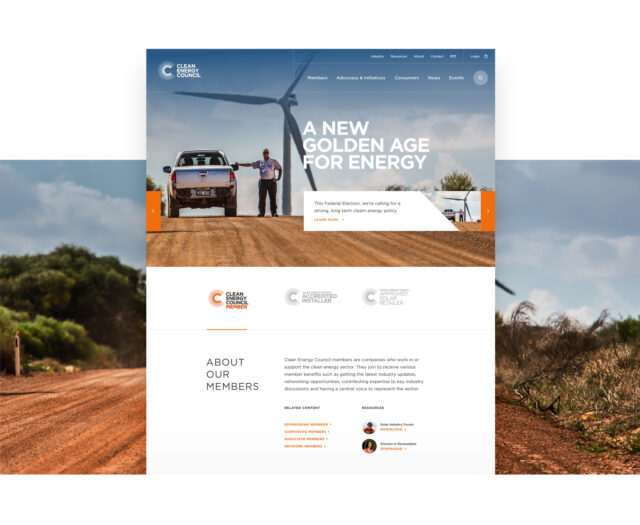
As the website houses a large volume of content, clean design would benefit all users. This meant using white space, bold use of primary brand colours and striking typography. We felt white and orange better represented the progressive nature of the organisation, adding an air of optimism as opposed to the black that featured in the previous sites.
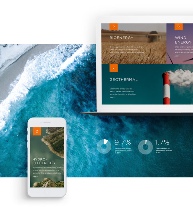
The new designs allowed for extensive use of imagery. Large photographic headers and footers across the site add context to content and create an instant impact.

Take a look under the hood
We built the website on Craft CMS – an easy to use content management system – and integrated it with Salesforce. The CEC uses Salesforce for customer and lead data, therefore, it was essential the website talked seamlessly with the existing CRM platform. Our developers built an API that would maintain Salesforce as the single source of truth – meaning all data is stored there and shared with the website.
Events are a key source of income for the CEC, with the organisation running around 60 events annually. Where large events once had their own microsites, they now appear on the CEC’s core site. Website visitors can browse events and click through to book on the Bizzabo platform. The platform has been modified to look and feel like the CEC site to keep users on a smooth path to purchase.
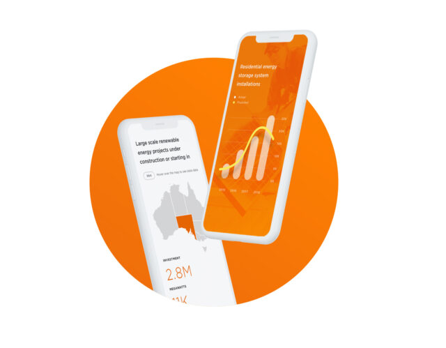
The CEC produces reports and keeps website visitors up to date with the latest stats. Our developers worked some Javascript magic to design and engineer interactive charts that bring reports to life. With a range of chart designs and variations to choose from, the CEC can edit the data in Craft CMS and create instant data visualisations to enhance stats across the site.

Overcoming challenges for instant results
Working in partnership with the CEC meant that we were focussed on business outcomes and audience needs throughout. The large scale project has been broken up into three phases; phase one is now live and phase two underway.
So far the project has reaped benefits for both audience and business:
- Created a consolidated home for the CEC
- Users can easily navigate resources and news
- Users can discover and book events
- Potential members can learn about and apply for membership
- Increased awareness for advocacy and initiatives due to prominent positioning
- The site search is enhanced for better user experience
- Operationally, the new site is helping reduce the need for users to call the CEC
- The CEC team find Craft CMS superior to their previous CMS, Magnolia
Evolution 7 delivered an outstanding new website for the Clean Energy Council which took a complex architecture and made our information easily accessible, visually appealing and ultimately delivered a highly improved user experience. This has been a massive improvement for our business and audience.
– Andreas Wenzel, Digital and Communications Manager, CEC
If you’ve got a complex or large scale project, our team can help plan and optimise for the greatest business impact. Contact us to learn more – the coffee is on us.