
Lifebroker
Insurance Made Easy
Lifebroker is the life insurance and income protection comparator of choice for over 465,000 Australians. Known for using clear, customer-friendly language, Lifebroker helps clients confidently choose between products, selecting one suited to their needs.
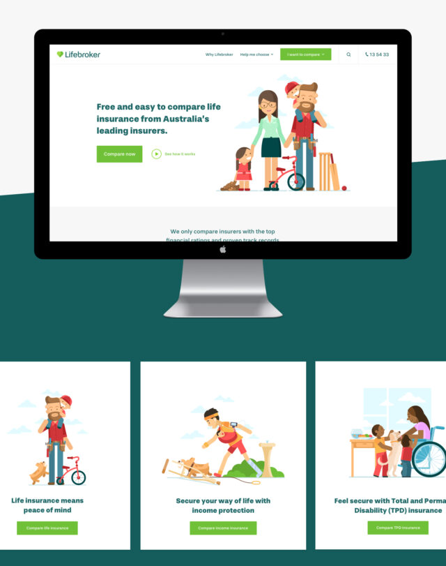
For years, Lifebroker has trusted us to craft interactive, engaging online experiences for a growing community of customers. Most recently, the team engaged us to design and develop a new website that would deliver an exceptional user experience; embody a refreshed, warmer tone; and promote conversion by simplifying the process of comparing life insurance cover.
Keen to hit the mark, we sat down and began brainstorming a website that would:
Cement the company’s reputation as Australia’s trusted “go-to” for category education and product comparison;
Reflect Lifebroker’s new branding;
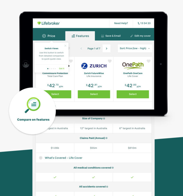
Communicate the features and details of different life insurance cover options; and
Generate business by seamlessly integrating the user journey with the comparison tool we’d launched as a stand-alone piece a few months prior.
Recognising our biggest challenge involved crafting a solution that balanced interactive tools against informative content, we sought feedback from the company’s most important stakeholder: its customers.
A focused approach
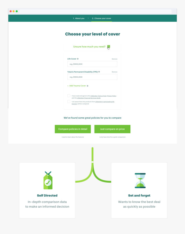
The project kicked off with a series of focus groups with members of the self-directed insurance market. These groups helped us learn more about customers’ expectations and experiences when visiting aggregator websites and choosing between brands. We identified three user types, each with different levels of financial literacy. Across these groups, a dichotomy emerged: some users visited websites like Lifebroker expecting a content-rich information hub, while others wanted a quick, easy, and action-oriented experience.
It’s all about the journey
Armed with insights, our Strategy and Design teams got to work mapping out detailed customer journeys for each group. Our goal was to implement a user-centred design that surfaced personalised information, and lead visitors through the site’s content and tools via custom pathways matched to each group’s preferences and needs.
Our customer conversations made clear that for this website to be successful, it had to be structured in a way that not only prompted an intuitive understanding of Lifebroker’s product offerings and incorporated clear calls to action, but also communicated the business’s credibility and accessibility. For this reason, we split Lifebroker’s website into two: an educational component bursting with SEO content, and a conversion-focussed segment with at-a-glance product information and quick paths to core features like on-site assistance, calculators, and the popular insurance comparison tool.
With our customer journeys top of mind, we moved ahead with integrating custom pathways throughout the website. For example, users can now choose between receiving a ‘Quick Quote’ or an in-depth overview of the benefits and features of each insurance product. Options like these not only educate, but also empower users to make an informed decision.
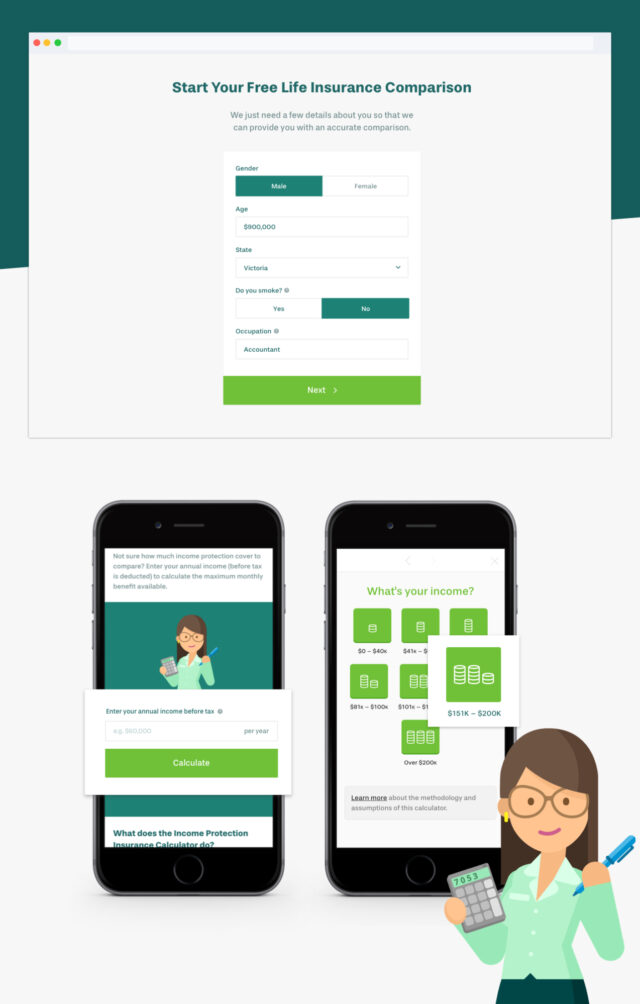
We also learned early on that all three user groups agreed the topic of insurance—particularly life insurance—can be complicated and confusing. To protect against these perceptions, we developed ways to present the product offering in an interactive way (making use of interactive tools and tables, for example), and enhanced Lifebroker’s approachability with conversational content and playful, vibrant illustrations.
User-friendly features
To stay true to agile, human-centred design, discrete pieces of functionality from the website were put forward for usability and user acceptance testing before releasing to the staging site. Feedback and user insights confirmed strategic decisions, informed subsequent iterations and, ultimately, resulted in a smart product with a suite of unique, customer-centric features:
Conversion-optimised product pages
We have placed considerable focus on optimising product pages for lead conversion. Despite functioning as part of the broader site, product page designs were reminiscent of stand-alone landing pages. Each page incorporates a rich narrative, detailing the relevant insurance product and providing users with snap shots of information about the product and Lifebroker’s service, encouraging them to move through to the comparison tool.
SEO integrations
Keeping in line with SEO best practices, our front-end developers completed extensive on-page and off-page optimisation to produce a robust, responsive site. We loaded all images from a CDN, using SVG whenever possible; optimised page load using Google PageSpeed tools; selected device-appropriate tap sizes and large, legible fonts; and executed sophisticated caching strategies.API development
We have integrated the website with multiple APIs to render complex datasets in both the comparison tool and Lifebroker’s enterprise CRM solution. To translate quote requests between the frontend ember application and the client's enterprise API, we developed a custom API. Doing so allowed us to apply additional logic to the native API and enhance the resulting user experience.
Complex hosting infrastructure
We architected the site on a base configuration of two web servers able to scale horizontally to handle peaks in traffic. Each web head is placed behind and only accessible by a load balancer that manages traffic and, in turn, increases security. Being a user-centric application, the load balancer provides server-affinity with sticky-sessions to assign a single server to a user. All assets are stored on a cloud server directly accessible via the CDN; this offers better caching strategy performance and facilitates destructible instances.
Algolia search experience
We replaced Google Custom Search with Algolia so users could surface content at lightning-quick speeds. This required close collaboration with Lifebroker to customise search logic in a way that balanced the return of relevant content against major pathways (insurance calculator, product landers).
High traffic, high reward
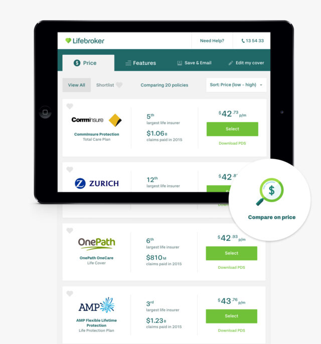
Our initial research pointed to significant opportunity to cater for customers who want to be educated and empowered to make their own life insurance decisions, and we based much of our website strategy around this insight. The finished product is structured in a way that carefully caters to different user groups and promotes high-quality lead generation.
Site statistics in the first three months following launch confirmed our approach, with increases in pages per session (+84.3%), average session duration (+29.2%), and a decrease in bounce rate (-28.5%) over the previous year.
Retiring Lifebroker’s mobile website in favour of a fully responsive site increased mobile traffic volume (approximately 20% of total traffic) and created a more complete, engaging experience for mobile users. After arriving on the site, mobile users are spending more time across more pages (+101.8% pages/session, +82.7% avg. session duration).
This increase in engagement went hand-in-hand with an increase in leads (+98%), lifting the conversion rate over 300% and fulfilling the task of integrating Lifebroker’s insurance comparison tool with the rest of the site.
Thanks to our friends at Lifebroker for another successful collaboration, and to Blue449 for lending their SEO expertise.
"Evolution 7 have been our digital agency for over 10 years, and with every project they continue to blow us away. We had very high expectations for this development and, as ever, the team at E7 didn’t disappoint. They went above and beyond to engrain themselves into both our business and the vision of the project. We’re so proud of what has been delivered. It has been truly fantastic to see the concepts come to life and the impact they have had on results." - Michelle Callanan, Senior Marketing Leader