Novas
Both Novas and Evolution 7 understand that the success of large projects relies on small details.
Novas is a well-established architectural hardware manufacturer and supplier based in Melbourne. They’re known within the architectural world for being reliable and trustworthy, and for having a strong value proposition with high-quality products. Though they pride themselves on their modern take on interiors for large multi residential and commercial projects, their websites were outdated and didn’t reflect this cutting-edge approach.
A different kind of fit out
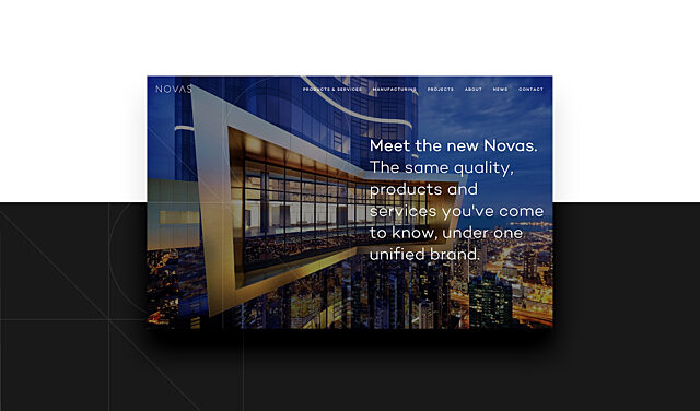
First established in 1996 as a specialist in architectural doorware, Novas grew to incorporate kitchen and bathroom products, joinery, and glass and glazing services, all of which operated under separate brands. This became somewhat confusing, so we initially helped Novas with a branding exercise and recommended that they bring everything together under one recognisable brand – Novas.
We believed this unification would highlight the comprehensive range of products and services offered by Novas and eliminate confusion over the relationship between sub-brands, positioning each brand as a business division instead. Once the brand architecture was developed, we created a striking new brand identity and began the mammoth task of developing a website for the new master brand.
User research
To guide this project, we conducted detailed user research, consisting of 1-on-1 interviews with a variety of users including architects, interior designers, project managers and company directors. Our aim was to find out how the market feels about the Novas brand and any pain points they experienced on the path to purchase.
Most users considered Novas as a mid-range brand with competitive pricing. They mentioned reliability, good service and pricing as key drivers for choosing Novas. When it came to the brand, people felt that it was outdated. Most users knew something about the sub-brands but none were able to name them all and they weren’t actually aware of the range of products and services on offer. Some users also found the website hard to navigate and consequently didn’t use it at all, though said they would if it was easier to understand.
The right structure
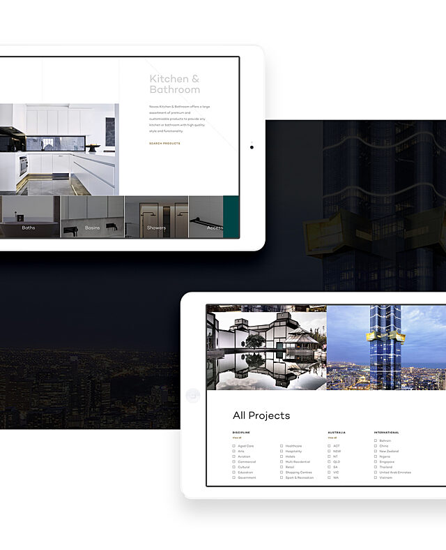
Integrating four brands into one wasn’t easy, and we had to make sure we created a structure that could host the content needed to equally display all parts of the business. This meant creating ‘Service’ pages for Novas Joinery and Novas Glass & Glazing, while Novas Kitchen & Bathroom and Novas Architectural Doorware were merged into ‘Product’ sections.
Each new division became a category listed under ‘Products and Services’ with its own landing page, and the result is a clearly structured, easy-to-navigate drop-down menu showcasing the complete range. We were also careful to highlight Novas’s manufacturing capabilities with a prominent tab on the homepage, as custom manufacturing is one of the company’s biggest USPs.
Getting a handle on product
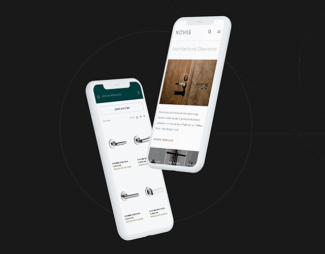
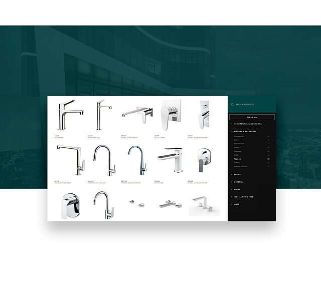
With over 16,000 products available, users needed a simple way to discover and filter products quickly. The previous websites lacked a good product overview and search function, which prevented users from both finding what they needed and discovering new products, but our developers knew Algolia could provide an enhanced user experience.
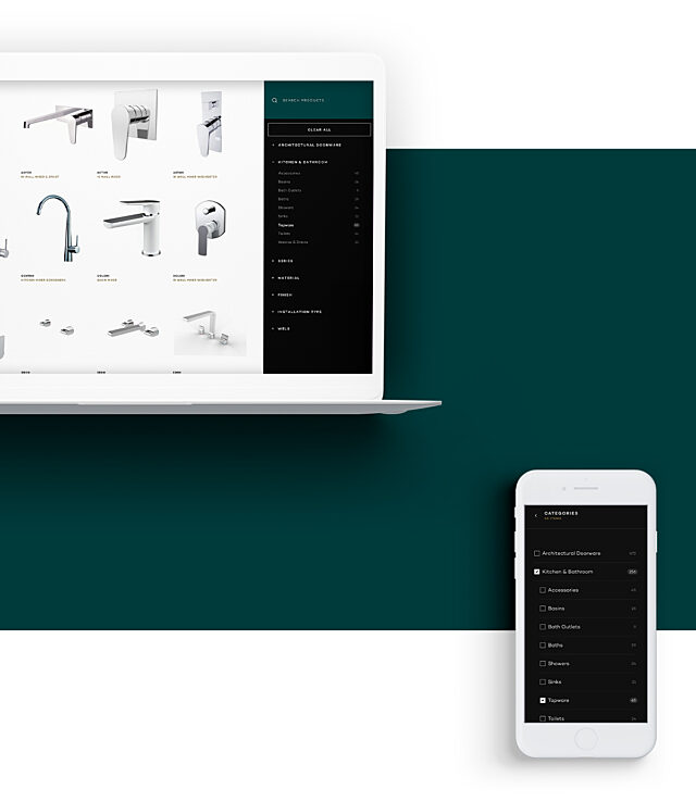
Algolia is cutting-edge search software that allows for lightning-quick response times and increased flexibility in delivering search results. Once our team implemented Algolia on the website, searches returned results that were comprehensive, relevant and instantaneous. The user experience was further enhanced by the option to filter products by series, material or finish, as well as individual product pages where users can easily navigate between product specs, finishing options and enquiries.
Going deep on data
Product data is the core of the site but we faced a challenge with the data integration strategy. Novas housed and managed their product data in a separate Enterprise Resource Planning (ERP) system, and we needed the website to leverage this data source to avoid double-handling and risk inaccuracies. We collaborated with Novas’s technical team to find a robust solution that worked with their systems and processes without adding significant overheads or data risk.
Thanks to some creative thinking, it functions as an integrated part of Novas’s IT system, allowing their internal team to continue using their existing toolset to create and manage product data while seamlessly keeping the website up-to-date.
The result
The Novas site is an outstanding example of considered UX and human-centred design, delivering a striking and user-friendly digital experience. With an open and approachable aesthetic, there’s plenty of additional information on products without the user feeling overwhelmed or the page cluttered.
There’s always a contact or enquiry point available so the user can reach out for assistance, and gentle calls to action have been placed, where appropriate, to direct users to additional services like custom manufacturing.
The ‘mega menu’ offers easy access to the main areas of the site, including direct links to search filtered by product category, and the overall design promotes Novas as a one-stop shop that can oversee products from manufacture to installation. Surprisingly, it’s quite uncommon in the architectural world for the specified products to also be installed, so highlighting the full service offered by Novas truly sets them apart.
All these elements help to make the website more helpful, personable and as close as possible to actually working side-by-side with a Novas team member. It would seem their customers agree. Google Analytics reveals a 99.8% increase in total sessions and an 84% increase in average session duration since launch*. Proving it’s now just as enjoyable as spending time on the new website as it is in the luxury developments they fit out
- Increase in user sessions
- 99.8%
- Increase in session duration
- 84%
*Comparing the 45 day period post-launch (August 15th to September 30th vs June 29th to August 14th).