Saxton
Transforming a dated directory into a world-class website
Saxton Speakers Bureau represents renowned speakers like Holly Ransom, Ita Buttrose and The Hon. Julia Gillard. Although curating household names for speaking engagements, their website lacked excitement and felt more like a tired edition of the Yellow Pages.
We were delighted to be selected to design and build a website that could respond to the needs of Saxton and its users. We kicked things off with UX research to guide our decision making and keep users front and centre.
The project transformed the passé directory-style website into a vibrant, energetic home for event speakers. Saxton’s new site has reinvigorated the brand and positions them as a leading player in the event space.

Putting the spotlight on Saxton’s USPs
Saxton represents an impressive range of Australian and international public speakers. Their exceptional talent portfolio and expertise allow them to skillfully match a speaker to an event - a pairing that will spark the imagination of audiences and transform any occasion from compulsory to compelling.
Saxton’s network of speakers is enough to turn competitors green with envy. Yet the existing site was challenging to explore. Complex navigation and poor design meant the site’s 6000 pages left users overwhelmed and unlikely to inquire.
Beyond the provision of speakers, Saxton offers supporting services to enable clients to plan and execute exceptional events. The company is known for its customer service which earns them stellar reviews.
The website redesign was an opportunity to put the spotlight on Saxton’s points of difference: its speakers and service.
The website wishlist:
Convey a clear brand proposition
Be mobile optimised
Easy to navigate
Be easy to maintain by internal teams
Work for Australian and New Zealand arms of the business
The largest speakers bureau in Australasia, Saxton has managed speakers for over 50 years. The website did not reflect their prowess, and it was time they had a digital home worthy of the Saxton name. But it wasn’t only the website that was outdated.
Refreshing the brand identity
Saxton recruited our designers to re-energise its visual identity for digital use. An essential step in Saxton’s evolution, it reflects the strength of their offering as they look towards future growth.
The synergy of core design elements – colour, iconography and typography – achieves a distinctive look that makes the Saxton brand stand out immediately. The logo badge enables use on a multitude of background types. The isolated ‘X’ icon – which reflects a sense of ‘coming together’ – can be used as an alternate logomark.
Information architecture for the people
The existing site contained a wealth of information, much of which got lost in an endless maze of navigation. To set up the new website for success, we had to ensure the information architecture (IA) was intuitive and straightforward for users.
UX research and navigation testing enabled us to structure the site in an instinctual way and permit users to complete key tasks: discover speakers, learn more about Saxton, enquire online and find relevant contact details.
We streamlined the IA significantly. Where the existing site had eleven items in the primary nav, the new site had four: Speakers, About, Resources and Enquire. A new mega menu clearly categorises options to direct users to relevant content in a single click.

A striking design that breaks corporate convention
The Saxton website offers services to a mostly corporate audience but – like Saxton’s speakers – we broke away from the corporate norm.
The goal of the design was two-fold:
Clarify the business proposition
Improve user experience
Leaving behind the stale directory of yesteryear, we created an energetic environment that’s easy to understand. Brand elements come together to present Saxton as a fearless and exciting business.
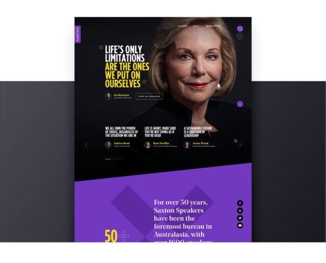
We embarked on a design that would put Saxton’s best foot forward. The quality of speakers is what sets the business apart, so we elevated the speakers and their wisdom. Striking photography presents the diversity of talent while typographical quotes reveal their insights. Further design elements – flat and interactive icons – add a sense of energy and movement throughout the site.
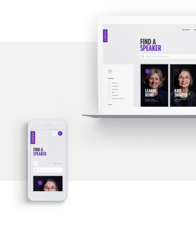
But it’s not enough to make the site look good. Saxton has over fifteen-hundred speakers, so we had to help users discover and distil. The streamlined IA and user-tested navigation enable users to find and refine speakers quickly. It can be done from the primary navigation and mega menu, and again within the search results.
The integration of Algolia search - a cutting-edge search tool - allows users to search by speaker, topic or type. The instant results never return zero, instead offering the most appropriate options for every query. Search results show speaker profiles with a short introduction and can be honed further from filters in the side navigation.

Take a peek behind the scenes
We built the site on Craft CMS to make it easy for the client to maintain. Internal teams can work together on content creation from a sleek, intuitive content management system. Different levels of access and version control are easy to set, making collaboration smooth across Australian and New Zealand teams.
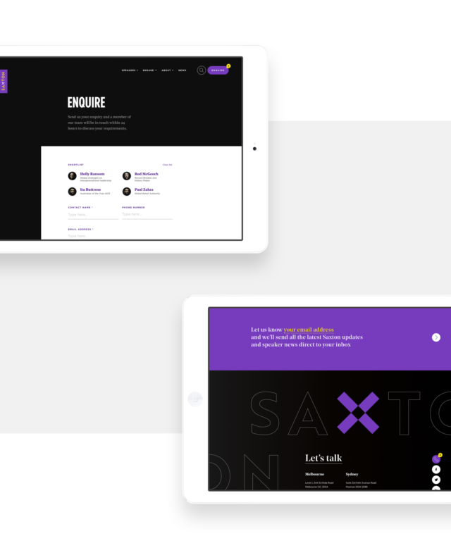
Integration with Saxton’s bespoke CRM platform S15 streamlines the transference and management of customer and speaker data. New enquiry forms and clear call to actions are in place to drive improved leads and conversions.

Saxton has a bold new website worthy of the name
When Saxton first approached us, they described their existing website as archaic, overwhelming and hard to use. Listening to their business, marketing and operational needs, we began plotting the foundations of a successful website redevelopment project.
UX research and testing ensured our work stayed focused on users and their experience completing tasks on the site.
Modern, lively designs broke the mould of stuffy corporate websites to put Saxton in the limelight. Bold design elements create an instant impact without overwhelming. Responsive designs ensure the site looks beautiful across devices.
Saxton has evolved. They are still the leading speakers’ bureau in Australasia, but now they have a website that shouts it from the rafters. The website has simplified the experience of finding event speakers and made the process enjoyable. Beyond the striking looks, Saxton has a site that is scalable and built for business impact.