
The Australian Ballet
Step into the spotlight and take a bow, ballet aficionados and neophytes! The Australian Ballet's website redesign is a dance of art and technology, a digital pas de deux that welcomes you into the enchanting world of ballet. A stage where captivating performances meet rich history, we've choreographed a digital masterpiece that lets you pirouette through pages with grace, dive into the riveting narrative of ballet, and secure your front-row seat with just a few clicks. This is not just a website; it's an unforgettable performance that plays on.
The Australian Ballet website redevelopment is a fusion of art and technology, encapsulating the grace, passion, and artistry for ballet devotees, newcomers, and stakeholders alike. The digital stage we have crafted invites users to embark on an unforgettable journey through captivating performances, rich history, and the boundless world of ballet.
The mission was to build an engaging, unified experience that transcends the ordinary, allowing users to connect with the Australian Ballet on a deeper, more meaningful level.
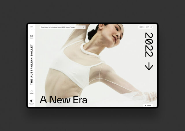
Embody elegance
Our challenge was to create an innovative digital experience that genuinely embodies the elegance and emotion of the Australian Ballet, while catering to a diverse audience with a wide range of needs and preferences.
Through extensive user research and interviews, we established clear objectives and information architecture, guiding our design strategy. We employed an iterative process of design and refinement in multiple phases, overcoming a range of design and technical challenges along the way.
This meticulous approach culminated in a harmonious synthesis of form and function, delivering an immersive, accessible, and engaging user experience that resonates with users, drawing them into the enchanting realm of the Australian Ballet and leaving a lasting impression.

The platform required the seamless integration of captivating storytelling, intuitive navigation, and visually stunning interface elements, whilst also integrating a complex 3rd-party ticketing system (Tessitura).
We took the challenge of bringing the elegance of ballet into the digital world head-on. Our comprehensive overhaul of the ticketing experience and seamless Tessitura integration allowed for a smoother, more intuitive purchase path. Users can now secure their seats for an upcoming performance, purchase merchandise from the TAB shop, and even learn more about the ballet in a single, streamlined transaction.
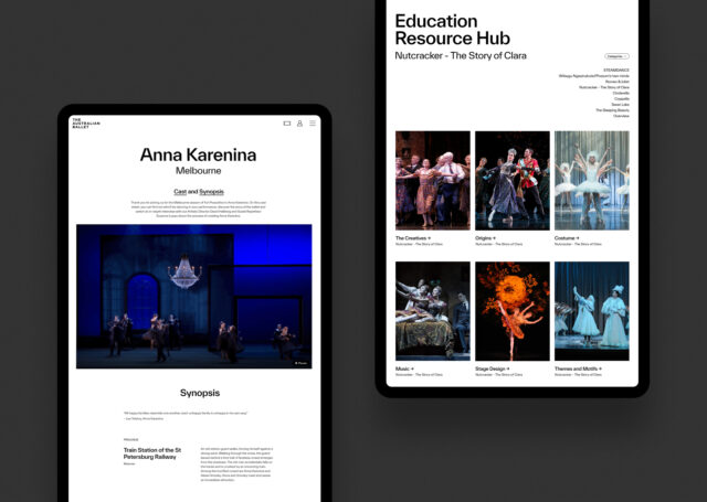
The website also offers comprehensive education sections and Ballet TV where users can watch live streams or purchase videos. This novel approach provides a rich, immersive platform full of long-form content and captivating narratives, pushing the boundaries of what a performing arts website can be.
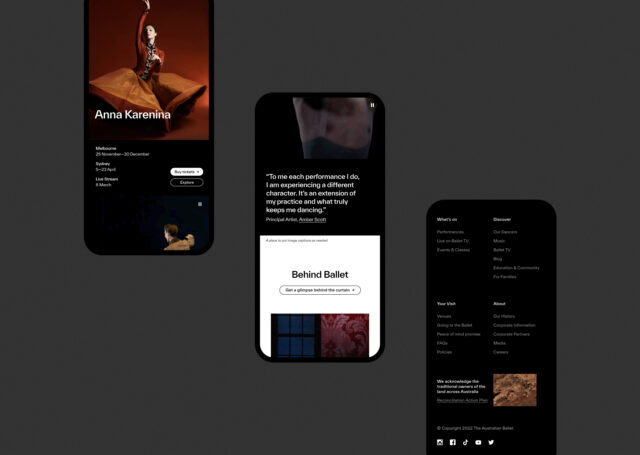
The visually captivating and emotionally engaging interface seamlessly conveys the elegance and artistry of the Australian Ballet, creating an intuitive visual language that communicates the platform's function and use. Users are effortlessly drawn into the immersive world of ballet, with the streamlined layout, powerful search functionality, and accessible navigation guiding them through the rich content.
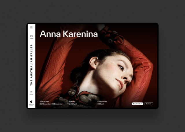
The project's clever, unique, and original approach blends a captivating visual language with advanced personalization, analytics integration, and seamless ticketing functionality, offering a new value proposition with an array of features.
Furthermore, the website employs cutting-edge digital design techniques and processes, utilizing new technology in a clever, imaginative, and original manner to deliver a truly innovative digital experience.
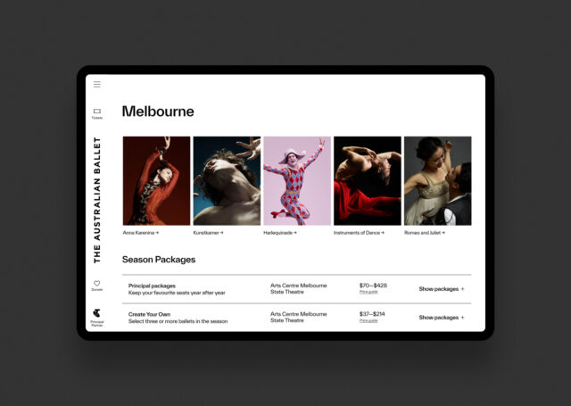
The result is an engaging, unified experience that transcends the ordinary, allowing users to connect with the Australian Ballet on a deeper, more meaningful level. It's not just a redesign, but a revolution. From in-depth performance overviews to interactive cast sheets and season packages, every detail has been considered and crafted with the user in mind.
