Visit Victoria
A corporate site with big ambitions
Visit Victoria is the state’s primary tourism, business and major events company. The government-run organisation works in partnership with the tourism sector to market Victoria’s inspiring experiences to maximise yield from visitors.
Not ones to shy away from lofty ambitions, Visit Victoria’s key objective is to build Melbourne and Victoria into Australia’s number one tourism destination. On the road to revitalising the visitor economy – by generating $36.5 billion in spending from visitors by 2025 – the team knew they would need help.
The Visit Victoria corporate site is the lead destination where businesses and individuals in the sector can learn about the wider tourism directive and tap into different levels of support. In order to corral the sector and align them under a shared goal, Visit Victoria recognised that first, they needed to revitalise the corporate site.

Understanding the pain points
We have over 10 years experience in building digital solutions for the travel and tourism industry; which was a leading factor in why Visit Victoria chose us to redevelop their corporate site.
After digging into the details and uncovering the pain points of their existing site, it became apparent that information architecture and user experience design would be key elements in delivering a website that worked for the sector. Furthermore, the Visit Victoria team wanted a site that was easy to manage, leading us to integrate Craft CMS, an uncomplicated yet powerful content management system.
Creating a product the target audience want to use
Technology is continuously transforming the tourism industry: from VR experiences to IoT connected hotel rooms to smartphone facilitated check-ins. The visitor market not only welcomes these innovations with open arms but expects it. However, the tourism sector itself is not always tech savvy.
Typically our audience would access the site using a desktop PC, through internet explorer, and with no sound or flash player capabilities. They would likely be browsing during workday hours, therefore, anything we could do to speed up the process of finding information would be a win.
A UX review of the existing site confirmed important pages and functionality. By using UX research to determine the overall architecture, we could avoid the pitfalls of the past. The strategy team started to construct the bones of the site with a structured sitemap.
The primary navigation would include About, Marketing, Events, News and Resources, with the rest of the pieces falling underneath in a secondary drop down. Users could now find what they wanted with a single hover and click. Alternatively, they can use the always-on search bar, powered by Craft CMS. Consideration was given to different enquiry forms and the newsletter, which had to integrate with existing email marketing software, Vision 6.

Approaching the design with clarity and simplicity
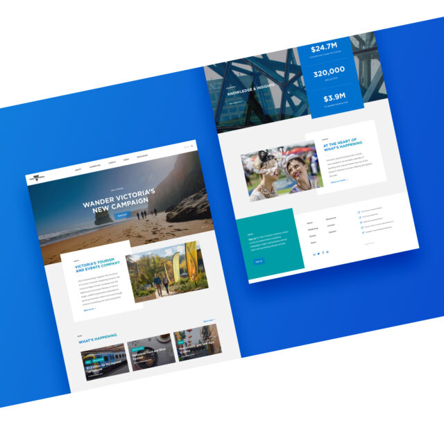
Visit Victoria is an established brand with documented brand guidelines. The website design respects the existing brand while exuding a certain fresh, modern, and professional look and feel. Considering our audience, we crafted a site that was clean, minimal, and image-led – using the impressive range of images we had at our disposal to bring the site to life.
The homepage has a dynamic carousel, showcasing the latest news and/or most important pieces of content. A quick scroll and the latest visitor economy results are displayed - keeping everyone on track with those big goals. Each of the sections of the site are accessible through different visually-led content blocks on the homepage. Important content is no longer hidden.
Behind the website sits an easy-to-use content management system, Craft CMS. Craft has won several awards including Best Content Management System, Best Wordpress Alternative and Best CMS for Developers.
It gives the Visit Victoria team the utmost flexibility and control over their website. Creating or editing pages is painless, and customisable components that allow different content types are already set up and ready to go. Furthermore, the live preview feature lets the team see what they’re doing in real time. This is a massive time saver, particularly when editing layouts or going through the in-house approval process before publishing.

Removing any barriers to education and communication
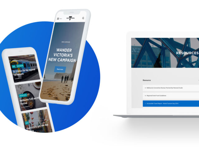
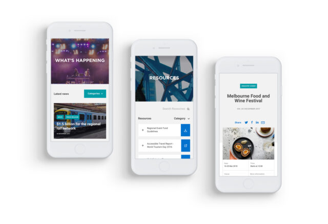
The corporate site is a tourism industry resource educating operators on what Visit Victoria can do for the sector. The information it includes, particularly in the resource section, is the meat on the sitemap’s bones. The resource section was coded to allow for a number of link options, including assets in the CMS (downloadable PDFs), external links, videos and internal page links. The section includes its own Craft CMS search bar, enabling users to filter the reports instantly.
As well as the visitor spending goals, Visit Victoria are aiming to support 320,700 jobs in the visitor economy by 2025. Keeping these targets front of mind helped guide our design and led to the development of a clear, useful and easy to maintain careers page. It can be accessed at all times from the secondary navigation and the footer.
The contact page prioritised the Melbourne HQ with an enquiry form visible. A quick scroll reveals the global offices from LA to London to Shanghai, making it easy to contact the right people in key markets around the world.
Users are encouraged to sign up to the newsletter in the secondary navigation and from a bold colour block on the footer of each page. This integrates dynamically with their existing Vision 6 email software.

Getting the sector on board
The previous site lacked clarity and the information it did contain was hard to find. By digging into the data and undertaking UX research, we structured a site that is intuitive and easy to use. Keeping our non-tech audience in mind, the design was kept minimal, clean and in line with Visit Victoria’s existing branding.
We brought Visit Victoria's corporate goals alive on the homepage to keep all users and tourism operators up to date with the shared objective of the industry. Once a user arrives on the homepage, it’s easy to navigate to the extensive resources and understand the support available - empowering users to do their part.
The Visit Victoria team love their new corporate site, thanks in part to the quick and easy maintenance provided through Craft CMS.